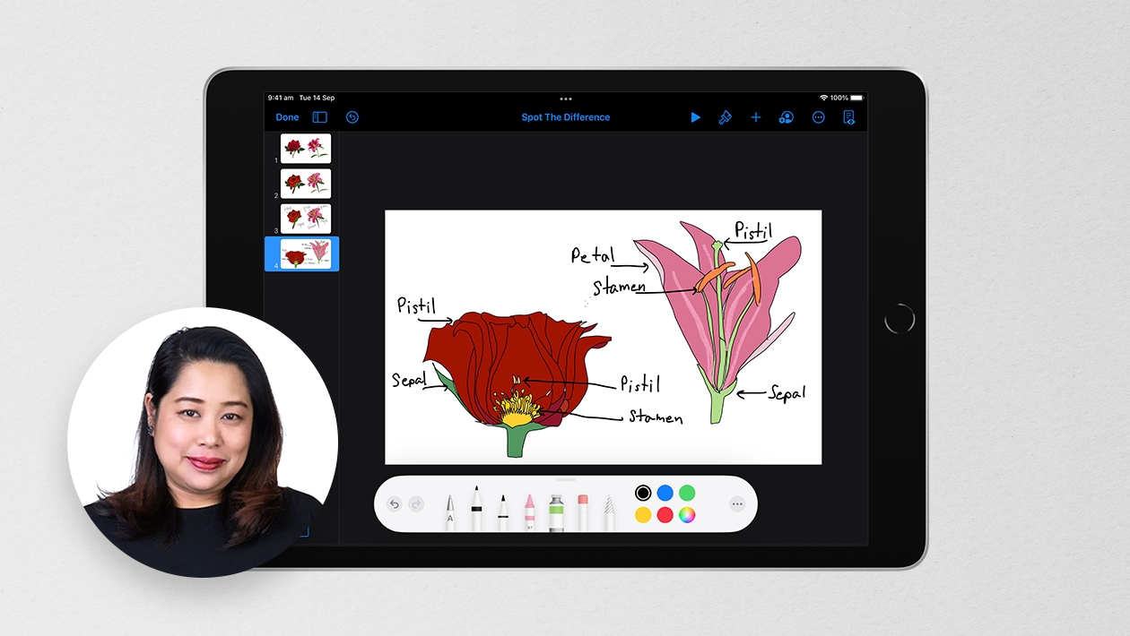
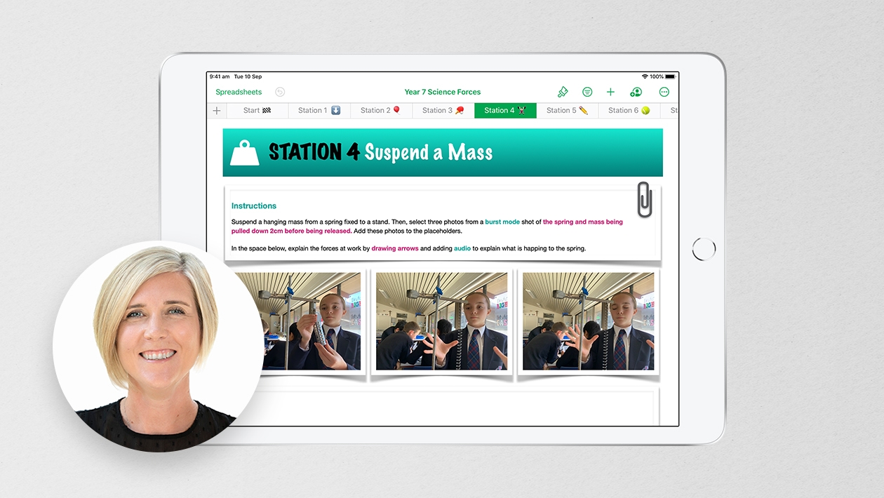
Last week, students completed a design your own experiment activity over heart health and the environment. After the experiment concluded, I asked them to create one pictographic or graphic that would summarize their data in an impactful way. Some students used Keynote, while others used Canva, but I loved the thinking behind it. What was the most important bit of information from this experiment that should be shared with others?


April 02, 2024 . English
I really like the pictographics! Great way to be visual as well as succinct with data. This helped me with a project I’m working on. Thanks Jodie!
This action is unavailable while under moderation.
This action is unavailable while under moderation.