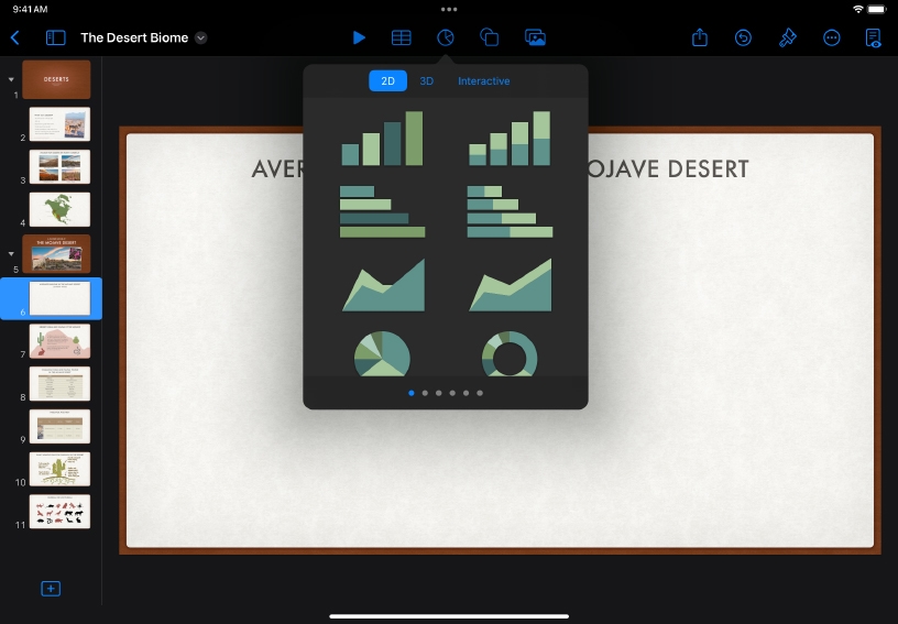
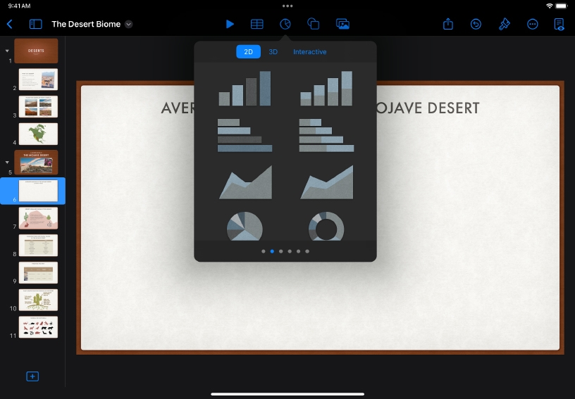
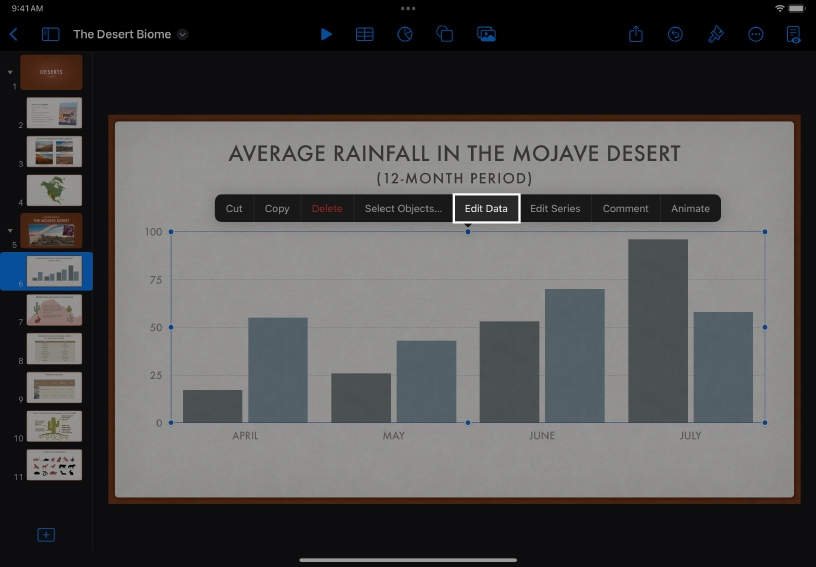
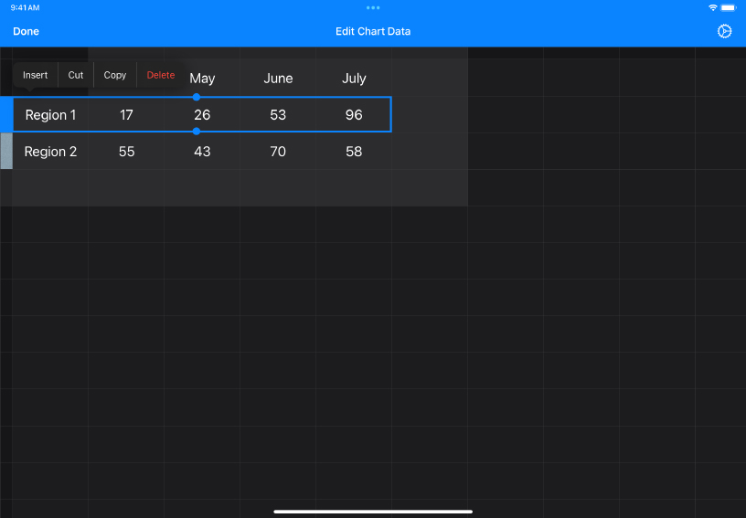
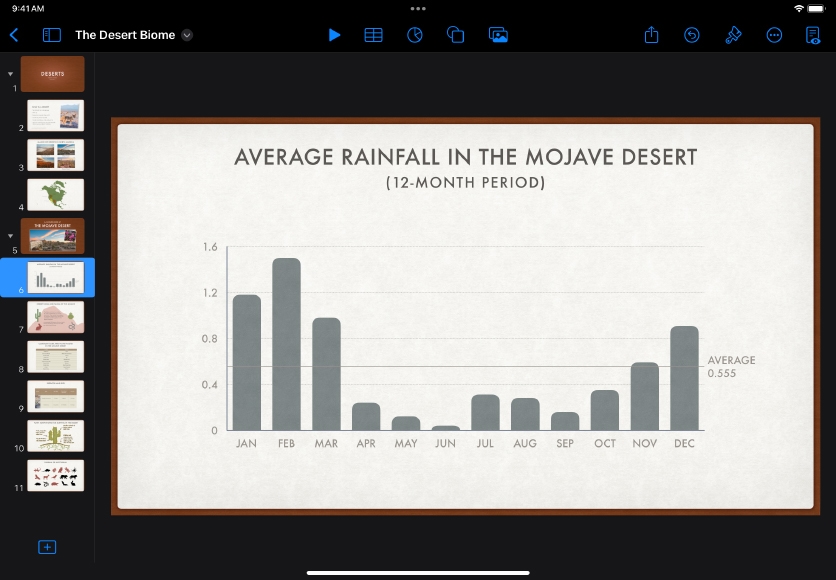
Visualize data with charts.

Keynote includes a variety of chart types for turning any set of data into expressive visuals. Explore how different chart types work better for certain kinds of data, such as line charts for changes over time or stacked columns for changes in composition.

Apply it.

  • Explore ways to visualize data using a variety of charts. Create a chart on one slide, duplicate the slide multiple times, then change the chart type on each duplicated slide.

  • Use everyday data to demonstrate averages, probability, and other statistics concepts. Collect the height, birth month, or other common details from your class and chart the results.

Go further.

Reference lines make a chart easier to interpret, allowing you to compare the values in the chart to a benchmark value. Try adding a reference line to a chart.

Learn more about showing reference lines