Visualize data with charts.
Charts can turn complex data sets into beautiful visuals that make information easier to understand. Choose from a variety of chart types to visualize things like class grades, club finances, and survey results.
Charts can turn complex data sets into beautiful visuals that make information easier to understand. Choose from a variety of chart types to visualize things like class grades, club finances, and survey results.
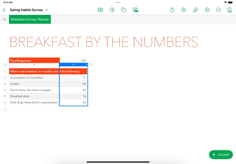

Select your data. Tap the top of the column or row of data you want to include in a chart.
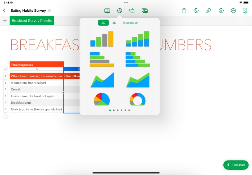
Add a chart. Tap Chart ![]() , then choose the type of chart you’d like to add. Swipe for additional styles.
, then choose the type of chart you’d like to add. Swipe for additional styles.
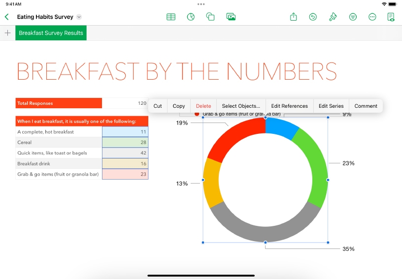
Refine how data is presented. Tap the chart to select it, then choose Edit References. Tap Data Series Control ![]() and choose Plot Rows as Series or Plot Columns as Series, depending on how your data is arranged. Tap Done.
and choose Plot Rows as Series or Plot Columns as Series, depending on how your data is arranged. Tap Done.
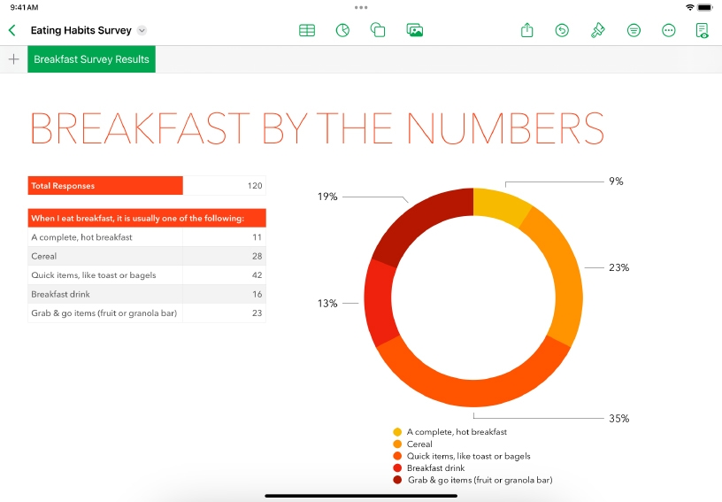
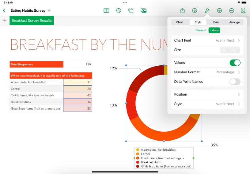
Customize the look of your chart. Tap Format ![]() , then choose a chart style and modify labels, colors, fonts, or chart type.
, then choose a chart style and modify labels, colors, fonts, or chart type.
Display the values of individual data points on the chart. Tap Format ![]() , tap the Style tab, then tap Labels. You can then choose the label display options.
, tap the Style tab, then tap Labels. You can then choose the label display options.
Add a title. Tap Format ![]() , tap the Chart tab, and then turn on Title. Double‑tap the placeholder title to replace it with your own text.
, tap the Chart tab, and then turn on Title. Double‑tap the placeholder title to replace it with your own text.
Reinforce the impact of data visualization and analytics with your learners. Create a variety of charts from the same data set to see which chart expresses the information best.
Explore how civic engagement has changed over time. Enter public voting data from multiple years into a table, then use charts to show the percentage of eligible voter turnout over the years.
Reference lines make a chart easier to interpret, allowing you to compare the values in the chart with a benchmark value, such as average or median. Try adding a reference line to a column chart.
Learn more about adding legends or gridlines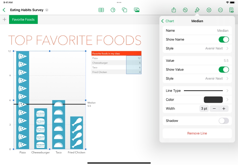
Share what you learned and help others discover the Apple Teacher Program.
A link to this page in the Apple Education Community has been copied to your clipboard.